For 50 years, the Frey Foundation quietly supported Michigan communities with a focus on housing, families, arts, and the environment. But as they looked to the future, the team faced a familiar challenge: a legacy brand that no longer captured their bold, new direction or reflected the third-generation leaders at the helm. They needed a fresh identity and a website that didn’t just look good but spoke volumes—directly to the people and places they’re committed to.
So, we partnered with Frey to turn their evolving mission into a living, breathing brand that could lead them confidently into the next 50 years.
Services:
Rebrand, Organizational Messaging, Web Design & Development
Share on Social:
Our Strategic Focus
Amplifying Their Impact, Without Losing Their Roots
We set out to give the Frey Foundation a clear, authentic voice and visual identity that communicates their dedication to place-based impact in Michigan. Our strategy went beyond just design; it was about creating a brand toolkit that Frey could use to connect deeply with their community while drawing clear boundaries around their mission.
Integrated Brand & Digital Strategy
We aligned Frey’s messaging, visual identity, and digital experience, all aimed at showcasing their unique role in Michigan philanthropy. It was essential to highlight the foundation’s roots without making them feel “stuck” in tradition.
Enhanced Storytelling
Frey’s new brand centers around authentic stories that resonate with their community—whether it’s the grantee in Emmet County or a family benefiting from accessible housing. This storytelling approach makes it easy for partners, grantees, and peers to see how Frey’s work impacts real lives.
User-Centric Design
The redesigned website is not just a pretty face; it’s a purpose-built platform where visitors can quickly find out how Frey is supporting their community. Every detail was designed to foster engagement, with a clean layout and intuitive navigation that reflect Frey’s approachable, collaborative nature.
Brand & Web Transformation
To truly capture Frey’s spirit, we developed an identity that combines their strong legacy with a forward-looking, vibrant personality.
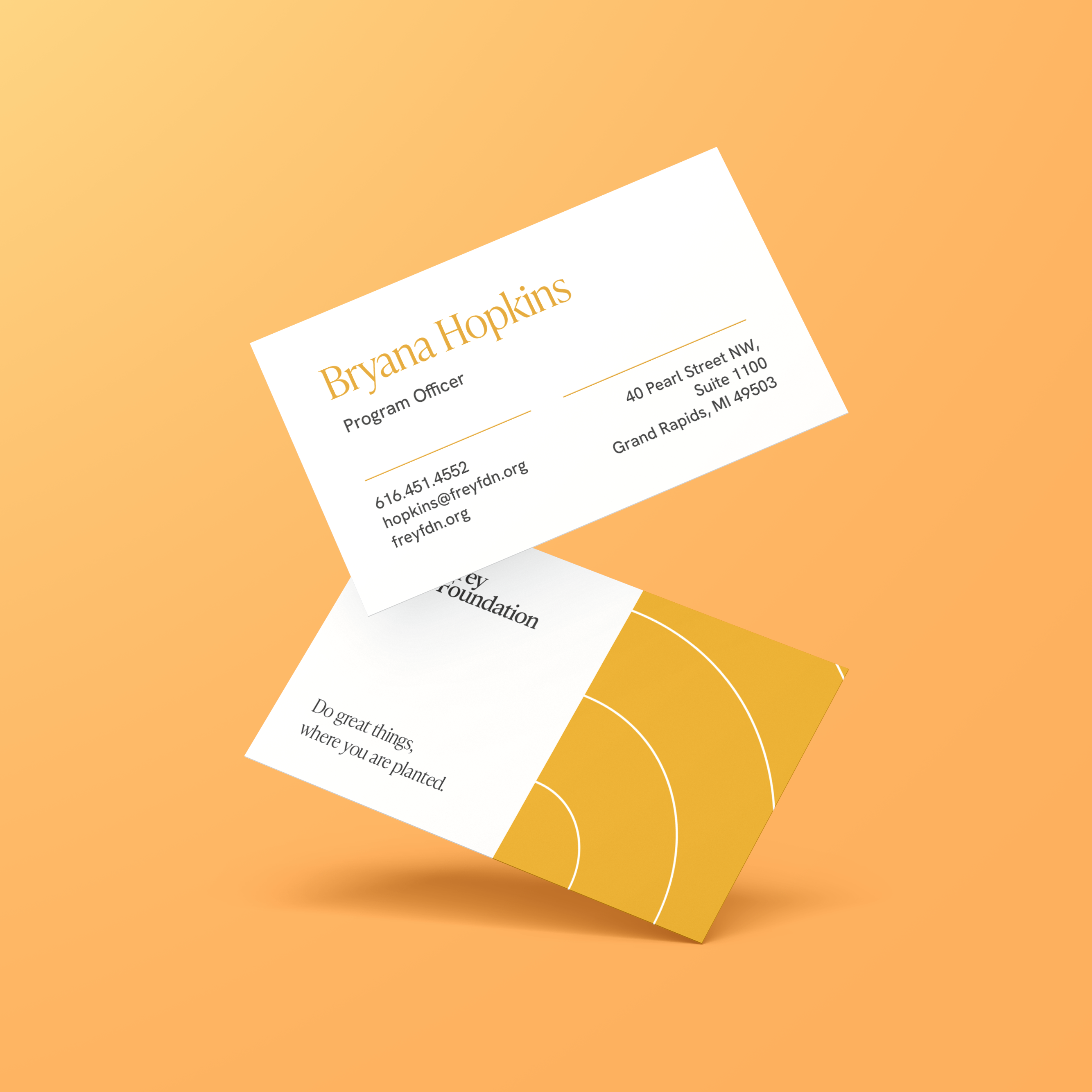
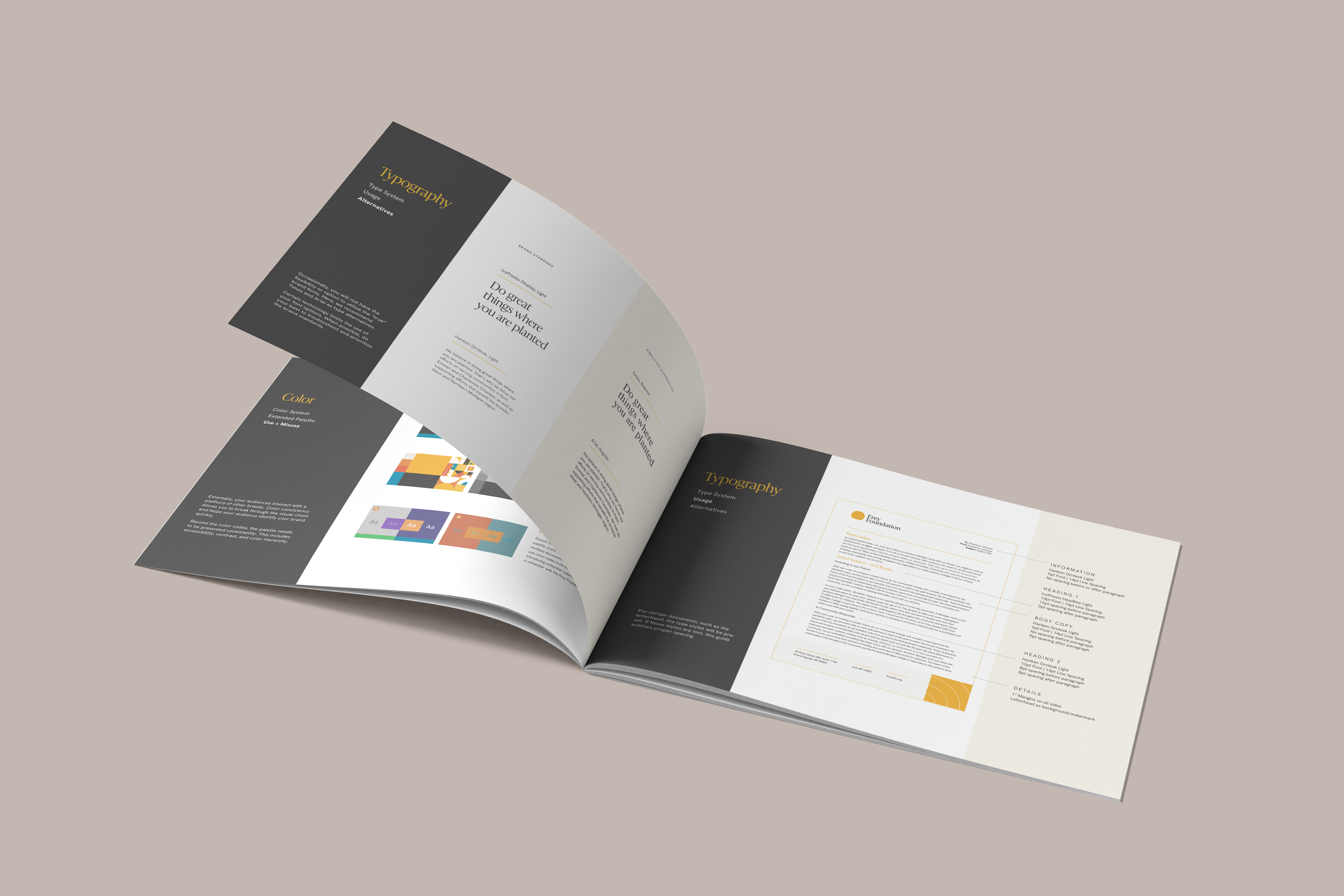
Visual Identity
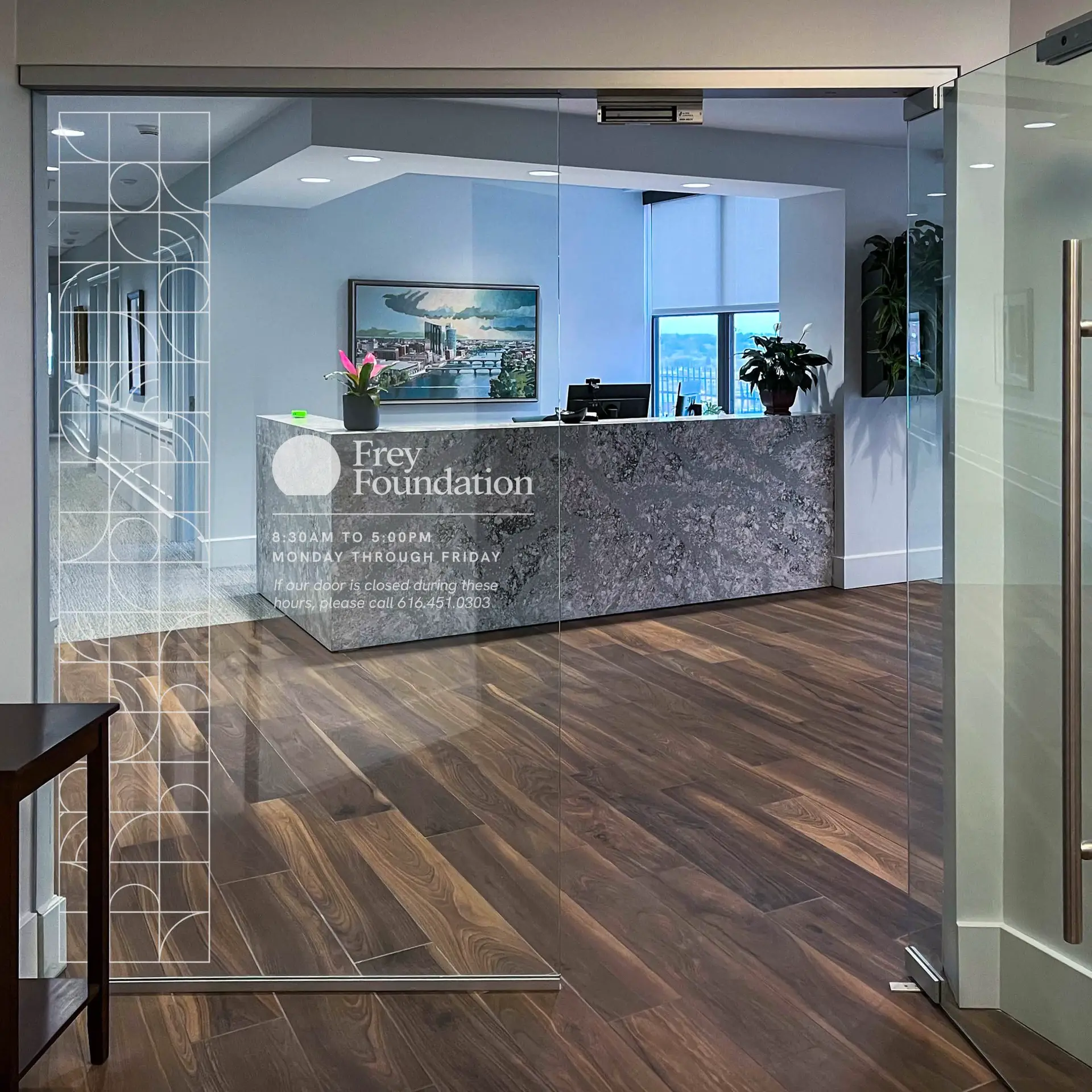
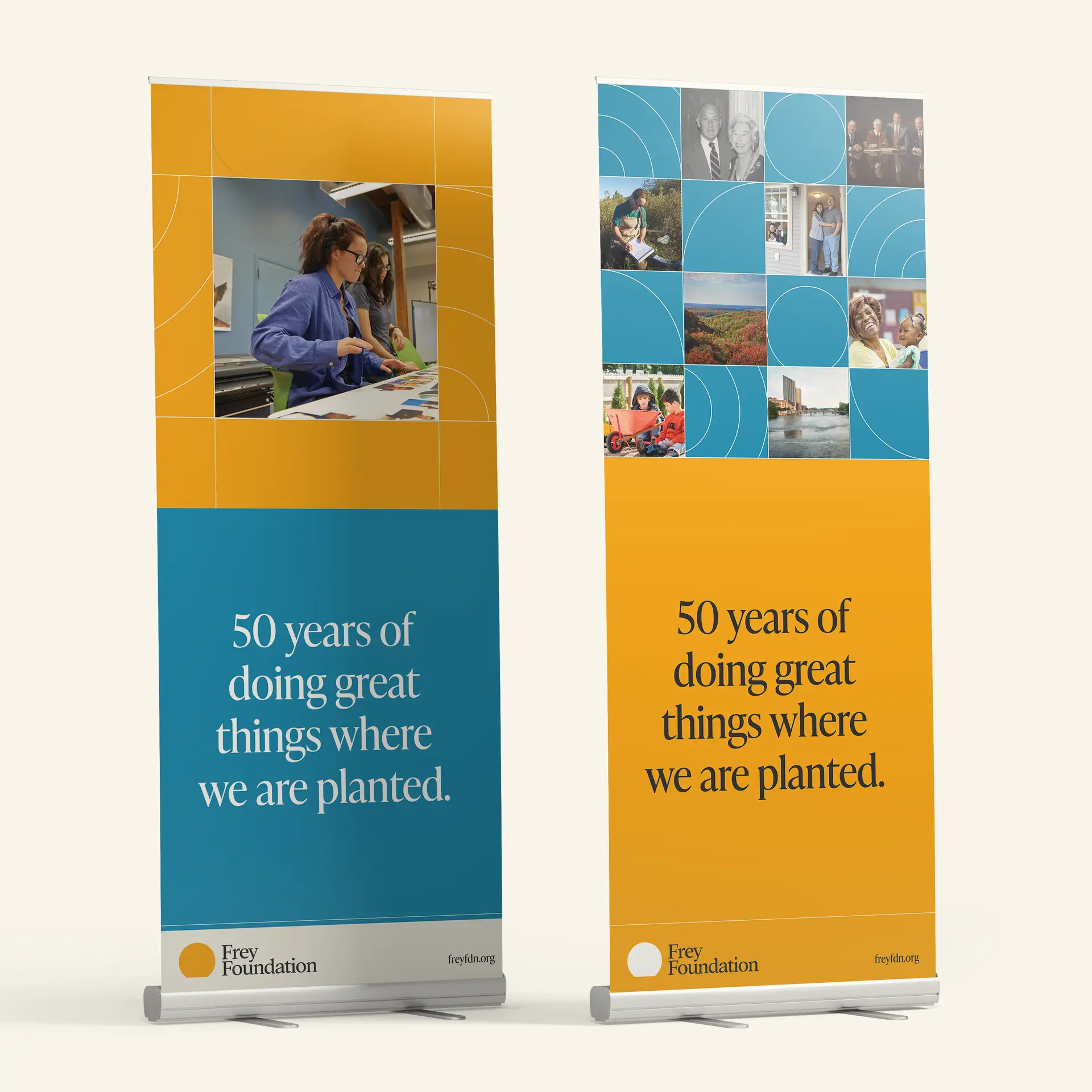
The new visual identity is inspired by Frey’s deeply-rooted commitment to Michigan communities. We chose warm, optimistic colors, led by their signature yellow, to represent their energy and approachability, paired with visuals that feel as grounded as the communities they serve.
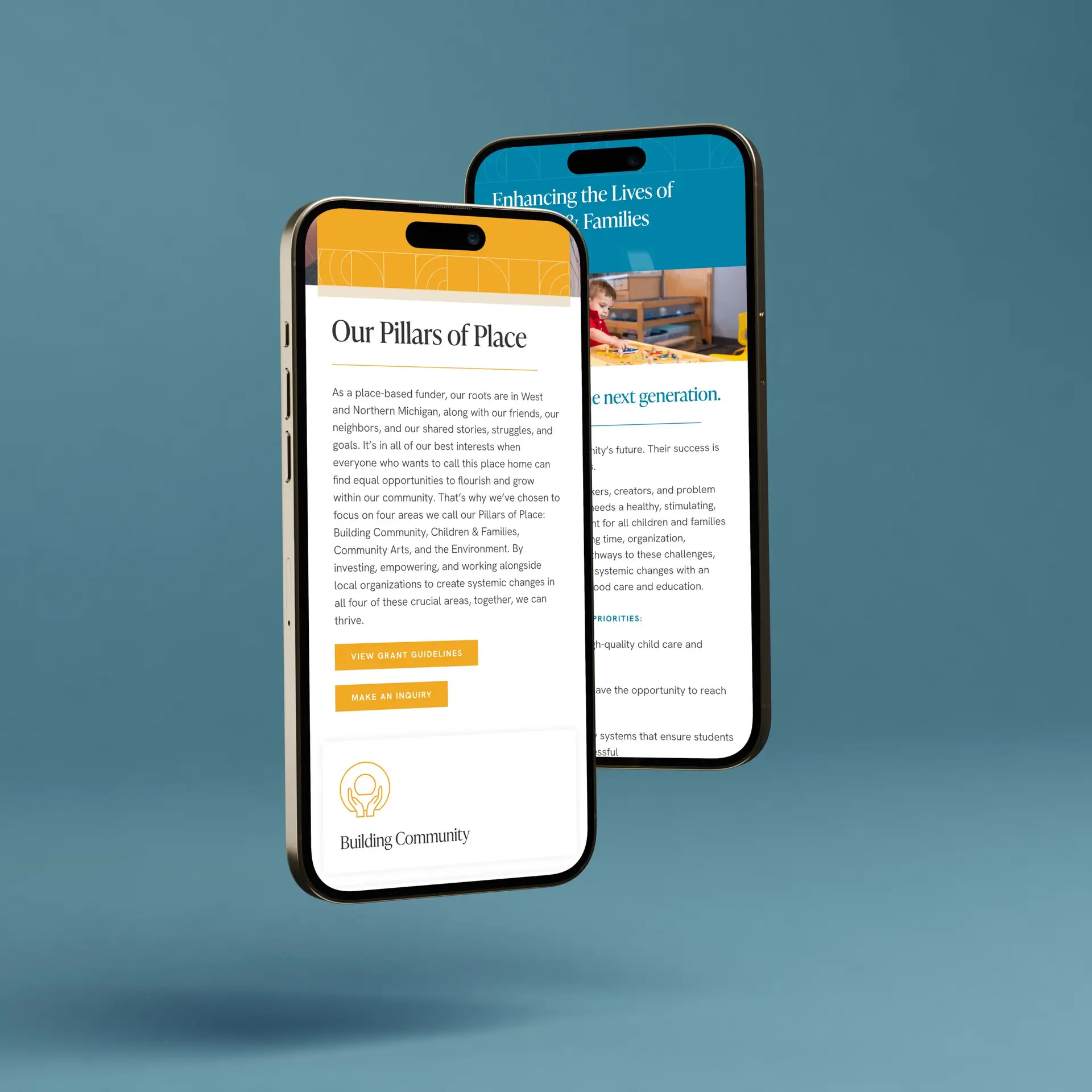
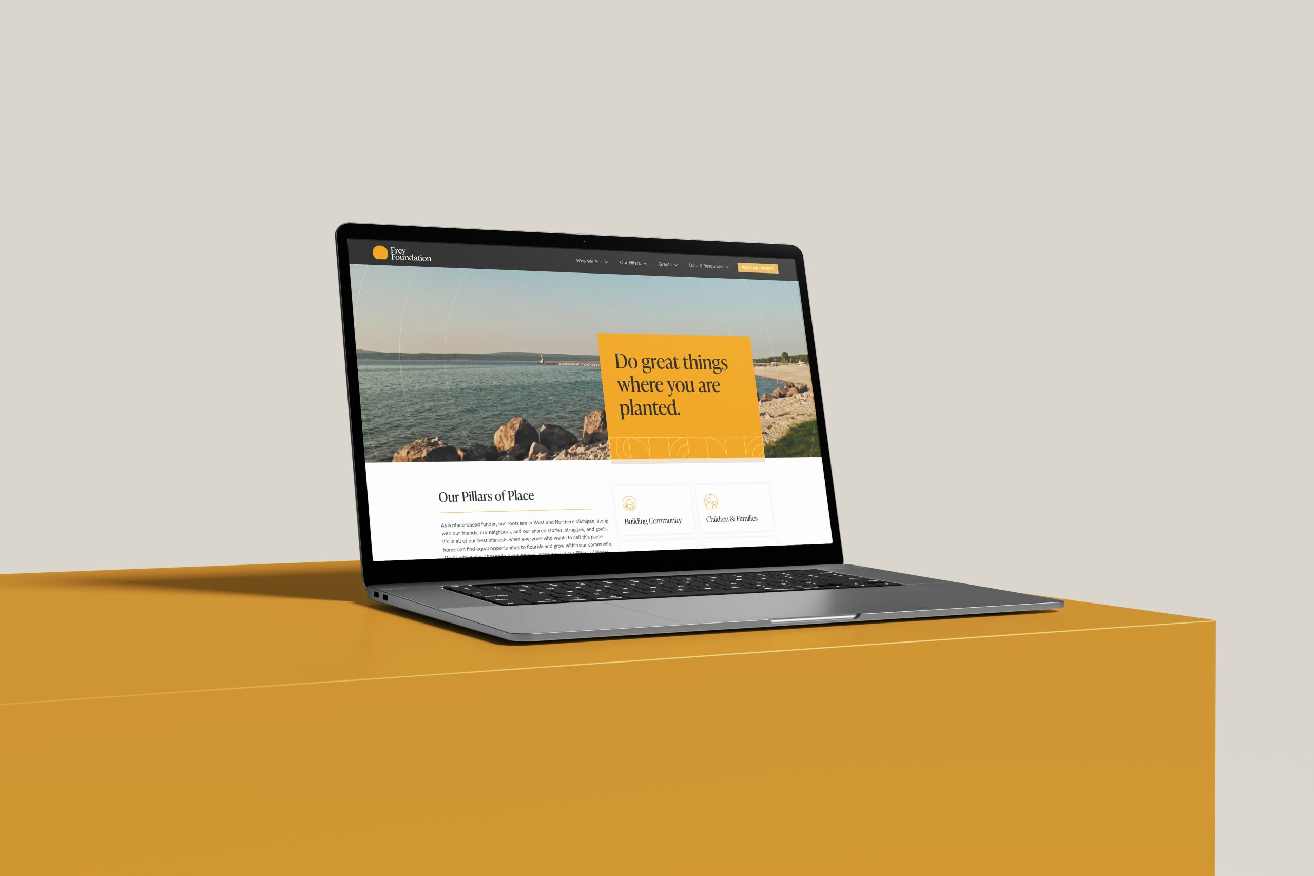
Website as a Gateway
Frey’s new website is the doorway into everything they stand for. It’s where people come to understand their mission, explore funding opportunities, and see the impact of Frey’s work first-hand. We designed it to be accessible, warm, and informative—a place where transparency meets action.
"Lorem ipsum dolor sit amet, consectetur adipiscing elit, sed do eiusmod tempor incididunt ut labore et dolore magna aliqua. Ut enim ad minim veniam, quis nostrud exercitation ullamco laboris nisi ut aliquip ex ea commodo consequat. Duis aute irure dolor in reprehenderit in voluptate velit esse cillum dolore eu fugiat nulla pariatur. Excepteur sint occaecat cupidatat non proident, sunt in culpa qui officia deserunt mollit anim id est laborum."
Name, Title, Organization
Results & Ongoing Collaboration
Since launching the new brand and website, the Frey Foundation has gained more than just visual appeal. They’ve stepped into a role as an accessible, visible community partner. The feedback has been overwhelmingly positive, with stakeholders and grantees finally seeing Frey’s values and mission reflected in every touchpoint.
As our partnership continues, we’re helping Frey’s team fine-tune their messaging and explore even more ways to use their digital platform to drive impact. Together, we’re empowering Frey to “do great things where they’re planted,” with the clarity and confidence that only a strong brand can provide.